- Published
Design System - Things Frontend Engineers Should Know
目錄
Note: This post is translated by AI. If you find any unnatural phrasing or errors, please feel free to contact me via email or other channels. Your feedback is appreciated!
Before talking about Design System, I want to mention a concept: "Planning > Implementation".
The nature of a software engineer is actually very close to that of an architect, except they build houses and we build systems.
A good house requires good architectural design, blueprints, understanding of the structure, and a lot of time spent on planning and design in the early stages.
This concept corresponds to Design System in web pages!
The Predecessor of Design System — Atomic Design
Before discussing Design System, let's talk about the concept of Atomic Design.
After all, the pioneer of web architecture design can be said to be Brad Frost, who proposed Atomic Design in 2013 and fired the first shot.
Later, Google created Material Design in 2014, and then Airbnb proposed a more complete Design System in 2016. For more details, you can refer to the talk by Karri Saarinen, Principle Designer at Airbnb.
So, what is Atomic Design?
Let's look at this picture first:
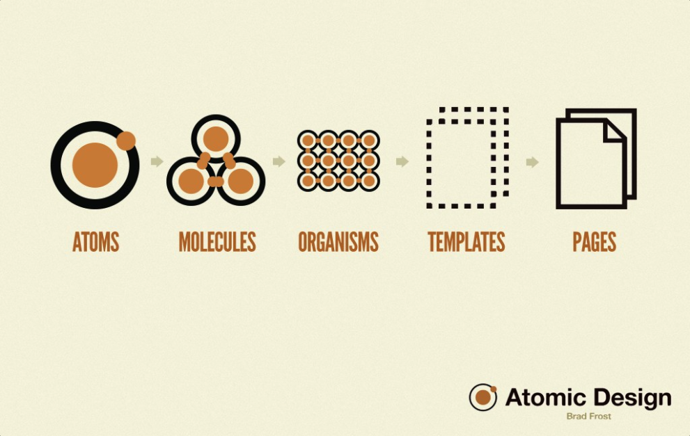
Simply put, it works just like the concept of atoms in chemistry. Atoms form molecules, molecules form organisms, but ultimately they form pages.
The correspondence between atoms, molecules, organisms, and elements in a page is as follows:
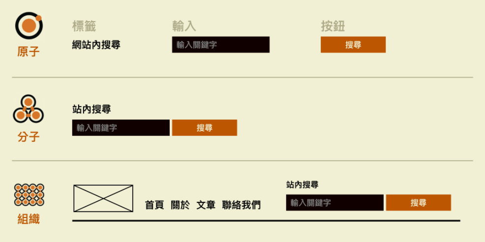
The essence of what I've been keeping you in suspense about for the past few days is right here. UI components like Input or Button are atoms. Input + Button can form a molecule (InputSearch). InputSearch plus other things can form an organism (Header), which then slowly builds up to Templates, and finally becomes a complete page.
This is a design philosophy of how UI components in a web page are stacked up one by one — Atomic Design.
Readers interested in diving deeper can check out the Atomic Design Introduction by UX East Meets West.
So what is a Design System?
It has many definitions, but the one most admired is still the one proposed by Airbnb:
“Set of shared and integrated patterns and principles that define the overall design of a product”
It points out that a Design System is defined by a set of shared, integrated elements and principles that define the overall design of a product.
This might still sound a bit abstract, so let's start with what problems Design System solves:
- Inconsistent interface experience
- For example, a web page might have many types of buttons, all performing the same function.
- Like a submit button appearing round here, square there, and then as text-only without borders elsewhere. Without a systemized interface design, users will be confused and unable to predict what the screen should look like.
- Reinventing the wheel
- Besides confusing designers and users, it's the same for frontend developers.
- They are all Buttons, but why is that one round and this one square? This often leads to needing to duplicate multiple Buttons with the same function but different styles, resulting in constantly spending time on basic setups.
How does Design System help us solve these problems?
As the definition says, it establishes a set of principles for design, distinguishing and regulating many units in design, such as colors, font hierarchy, spacing, sizes, etc., and then designing various components based on these, leading to the style of the entire system.
Since there are rules, frontend developers can write these rules first during development. Subsequent component and page development can follow these written rules, greatly reducing duplicate code. Whether it's unified correction or rewriting later, it can be done in one go.
Besides, there are the following advantages:
- Accelerated development process → Reduces duplicate code
- Better product scalability → After unifying specifications, corrections and expansions don't require modifying components one by one, just modifying the main rules.
- Focus on the product itself → After unifying component rules, one can focus on the business logic on the page, improving the user experience of the overall website operation flow.
Atomic Design vs Design System
Atomic Design was proposed earlier, describing the design philosophy of how components are assembled into a complete page.
The subsequently derived Design System finds rules in web pages, pushing the application level broader. It thinks about common needs encountered in components and component assembly, pulls these needs out to the system level, allowing you to define the style and settings of the entire website first. Places where it is used can be as small as a component or as large as an entire web page.
Does Design System have disadvantages?
Of course! But they aren't exactly disadvantages, mainly depending on the usage scenario and context.
Everything in software development is a trade-off. The evolution and application of principles and technologies mainly depend on the situation. No matter how complete the architecture and system are, there are scenarios where they are unsuitable. So here are some scenarios to consider when using a Design System:
- Small projects and small teams are not suitable
- On the team level, if manpower is insufficient, just the time to design the Design System might take until the project closes. And with few people, communication is relatively smooth, many things can be synced up on the spot.
- On the project level, because the project is too small, creating a Design System will only tie your hands. It's better to just finish the project directly.
- Maintenance and product iteration considerations
- Design System is a set of principles and defined elements. As more projects use it, usage scenarios will become more diverse and complex. Therefore, this system is not something that can be used for ten years once designed; it needs to be dynamically updated. It's impossible to create one version and be done with it forever.
Element Introduction
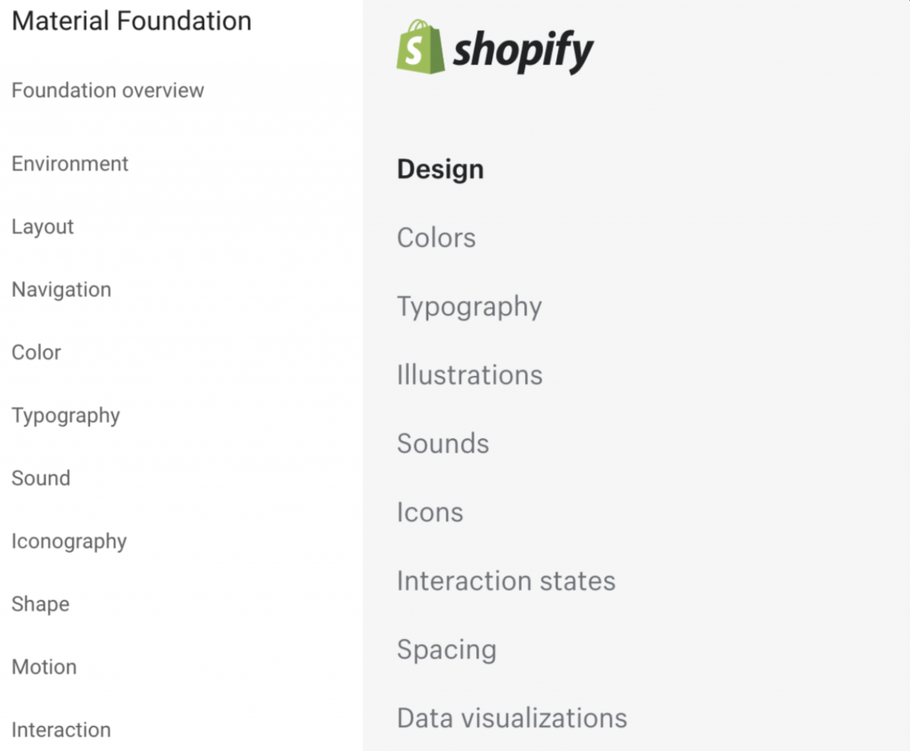
Different Design Systems will make their own trade-offs on which visual elements need to be defined, adding or removing elements as appropriate.
For example, the elements included in Material Design and Shopify's Design System are slightly different:
Below I will introduce what Design System really contains through Material Design and Shopify Design — Color System, Typography, Spacing, Icon, interaction states, and Motion. Actually, color codes, font sizes, spacing are basic visual elements needed by web pages and UI components, while sound and animation are more advanced elements.
Color System - Palette
Reference: Material Design - The Color System
Color System is often named as Palette.
Color is a very important element in a website and one of the ways to quickly make people identify the brand.
Material's management method mainly defines three roles:
- Primary & Secondary colors
- Different variants (dark/light) assigned to primary and secondary colors based on usage scenarios
- Other UI colors, such as background, surface, error, typography, and iconography colors.
At the same time, Theme can be used to set Alternative Colors to support various usage scenarios.
It can be used to support Dark Mode.
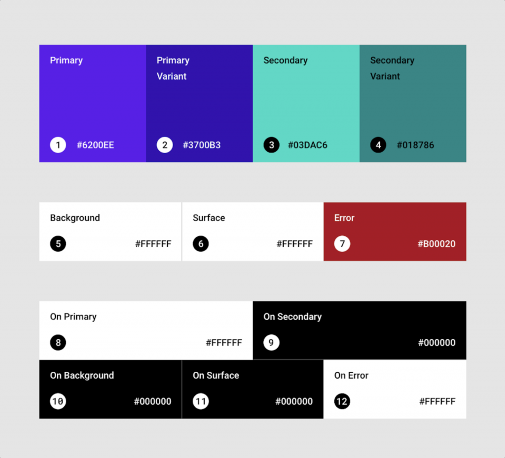
The third role mentioned above, "Other UI Colors", is the most complex part of the Color System because we need to "define color names to be used in various scenarios", which means semanticizing your color codes.
What does this mean? Let's use the color blocks used in this picture as an example:
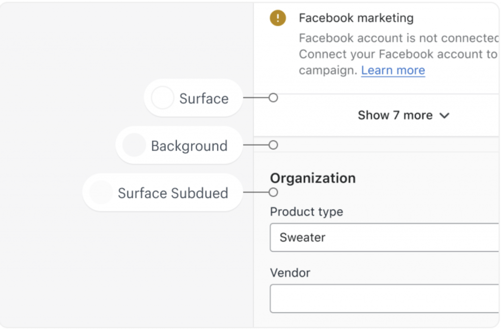
Background: Refers to the background color of the web page.
Surface: Refers to the background color of various UI components. The background color of UI components is like their surface. UI components in a system will share a same background color to contrast with the background, such as main content, cards, or popups. Using Surface allows users to clearly know that this is a block different from the background, an independent component.
Surface Subdued: This naming is a matter of opinion. It is also used to present color codes of different areas. It needs to be noticed by users but not as important as Surface, yet cannot be the same color as the background. For example, form background color can use this.
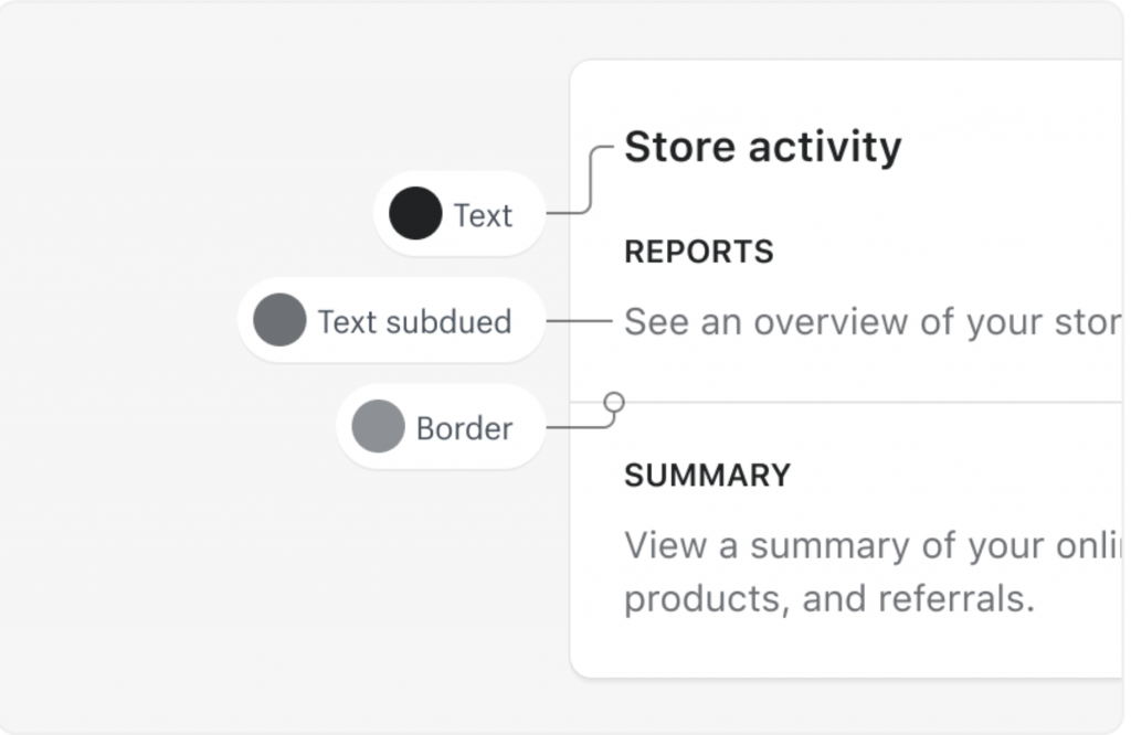
I want to emphasize here that the logic of naming actually depends on how each Design System defines it. Most mentioned above are conventional naming methods, such as Primary, Secondary, Background, Surface, etc. The definitions of other more detailed UI colors depend on how each system sets them.
Here are some more scenarios for everyone to feel:
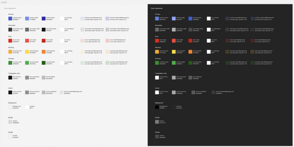
Finally, the fully defined Color System roughly looks like this on Figma:
(Tomorrow Day 08 will talk about how to implement your own Palette in a web page!)
Typography
Reference: Material Design - Typography
In Design System, the text system has a proper noun called Typography. It refers to the art of making text legible, readable, and appealing through arrangement.
"Typesetting" includes the selection of typefaces and point sizes (h1~h6, ...), line lengths, line-spacing, and letter-spacing, etc.
Typography essentially has such a table in Material Design:
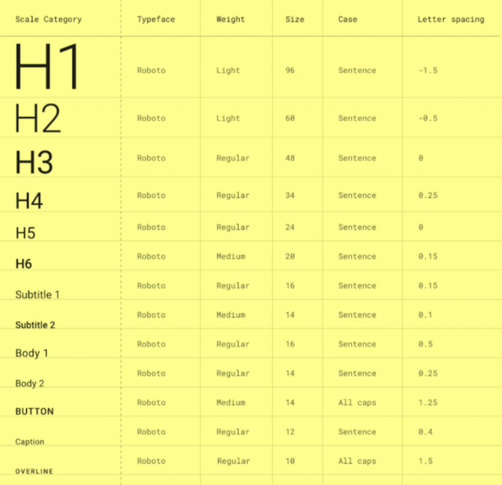
Basically, the entire Font Family will be unified, like Roboto in the picture. Each font level reflects differences through Font Weight, Font Size, Letter Spacing, and Line Height. These attributes are the options we can customize when using a Design System.
The text hierarchy in web pages is roughly written as in the picture, and the scenarios corresponding to each level should be quite intuitive.
In Material-Design, H1 ~ H6 are applied to headings, Subtitle is subheadings, Body is applied to large paragraphs of text (similar to p), Caption is description text for photos, and Overline refers to text with an overline.
But actually, how to define and use it in each system varies from person to person. For example, a project I participated in before didn't define the Subtitle level, but defined Input 1~3 to meet our usage scenarios.
The remaining implementation will be introduced in Day 09!
Spacing
Reference: Shopify Polaris - Spacing
Spacing is basically what we know as Padding & Margin. Consistent spacing creates visual balance, allowing users to browse the web page more easily.
It mainly needs to define the distance between elements, as follows:  !
!
Finally, like Typography, a Spacing hierarchy table will be produced, like this:
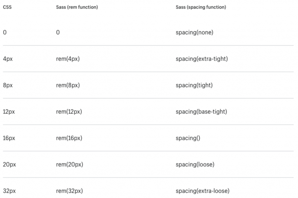
With this table, the distance between all elements is just different levels of spacing. Design only needs to mark spacing-1 on the draft so engineers know it's 4px. Engineers also only need to write CSS variables at the beginning, and subsequent applications and modifications just need to change the variables.
What's great about Tailwind here is that it has already preset a series of Spacing for you. Use Tailwind to use it painlessly without making too many settings yourself!  See Tailwind Spacing
But note that not all Padding and Margin can be replaced by Spacing. Only those distances you want to scale uniformly when used are suitable. In some cases where you want the distance between components to be fixed, you can hardcode it.
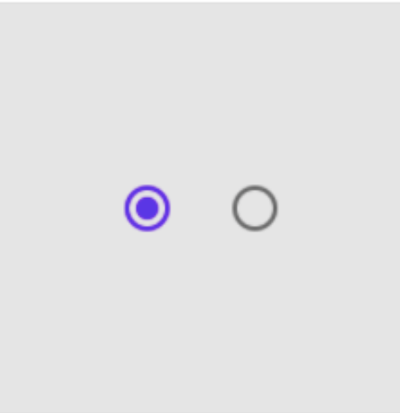
But for some cases where internal distance of components is fixed, like the distance between the colored area in the center of a Radio and the circular frame, it is not suitable to use Spacing. Because you wouldn't want the whitespace inside the Radio to enlarge when the spacing of the entire web page enlarges, causing the button to look strange.
Of course, such exceptions are a minority in the entire system, so just remember "The main usage scenario of Spacing is to facilitate unified adjustment of distances between components"!
Icons
Reference: Shopify Polaris - Icons
Icon is also a very important element in modern websites. It is a visual aid tool to assist in presenting common operations, files, devices, directories, etc. It not only adds beauty to the web page but also helps users understand the web page faster.
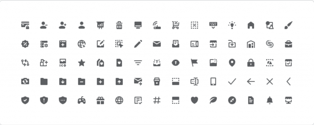
Common Icons are roughly these:
But there are actually infinite types of Icons. Depending on different web designs, Icons also need corresponding customization, such as degree of rounded corners, hollow or filled, etc. Here are a few websites recommended for finding Icons:
Implementation details about Icons will be introduced to everyone in Day 10.
Interactive States
Reference: Shopify Polaris - Interaction States
Interactive states, as the name implies, are various possible states after the user operates on the component (mouse, touch, key events, etc.). It is also an important element to let users know the current component status. For example, clicking a button should have a Pressed state, and a disabled one should show Disabled, etc.
For example, the state display of a button can refer to the following figure:
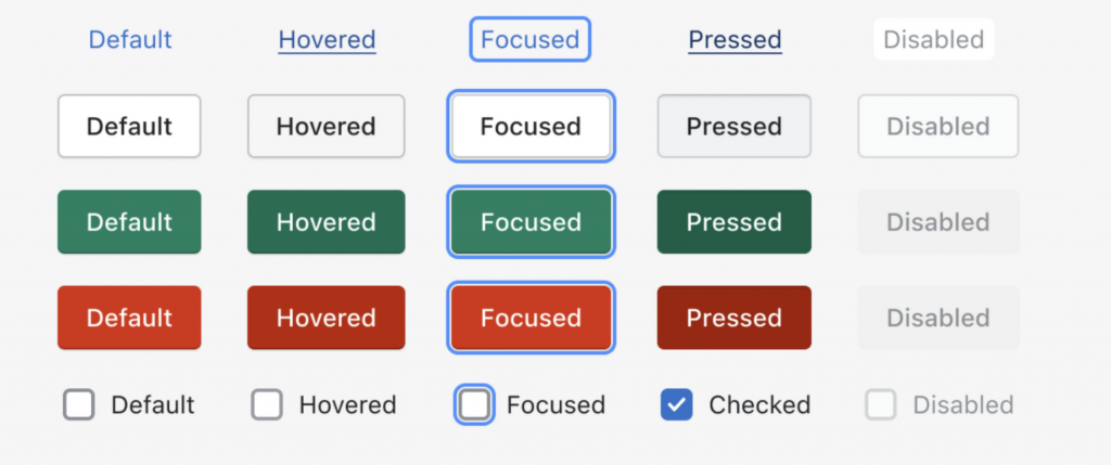
Focused is just as its name suggests. This state can prompt the user to the focus of the entire page — "the component currently being operated". It is also the main state when implementing accessibility functions (A11y). Simply put, when you keep pressing the Tabs key in a web page, you are switching focus.
Also demo the states of hover, activated, selected in a web page:
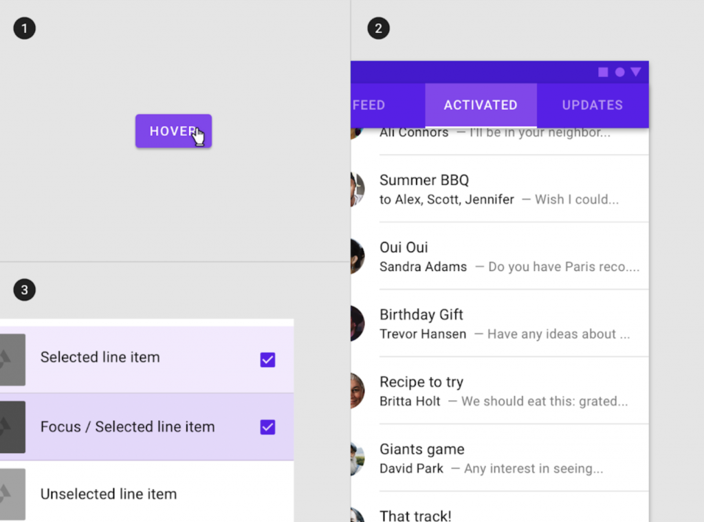
Interactive UI components in web pages basically have these states. In the same website, the presentation of these states needs to be consistent, like error color codes must be the same to avoid confusing users.
States should be additive rather than unique. If a component currently has multiple states triggered simultaneously, they should all be displayed instead of selectively displayed. This way, users can correctly perceive that the current component has multiple states triggered, and avoid functions we made on certain states not being triggered correctly. Like the Focus state, we can also see in the bottom left of the figure above that when Focus and Selected states are stacked, it is different from pure Selected.
(Implementation part will be introduced to everyone in Day 21 - Button with Button!)
Motion / Transition
The last thing to introduce is the "animation" of web page components! Modern web pages use animation extensively to create instant feedback for components, creating a more intuitive user interface, thereby achieving a better user experience. Using "Motion" in the title is actually a bit exaggerated. After all, component implementation is just Transition, and implementation on components is also called Transition.
Transition refers to the form of animation presentation. Because component animation usage scenarios are usually opening or closing, appearing and disappearing. Like when opening a Modal, animation effects like scaling and expanding will be applied during the process from nothing to something, so it is a transition.
And Transition already has many common types, as follows:
- Collapse: Opening a UI component is like pulling open a drawer.
- Fade in/out: UI components slowly appear and disappear.
- Slide: UI components slide in from a certain direction.
- Zoom in/out: Make UI components larger or smaller.
There are others like rotate, transform, etc. that can be defined, but let's just list these for now!
I won't put more videos here. You can pair it with Material's Demo, or 8 SIMPLE CSS3 TRANSITIONS THAT WILL WOW YOUR USERS to understand various Transition types.
After discussing types, Transition also has two important parameters: Duration and Easing. No matter which transition type, you need to define these two parameters to truly achieve visual transition effects.
Duration
The time from the start to the end of the animation. It will be adjusted according to the screen range affected by the animation. The smaller the range, the shorter the duration, usually expressed in milliseconds.
Easing
After defining the Transition time, you then need to adjust the quadratic Bezier curve to achieve different acceleration and deceleration effects during the transition period.
What is a quadratic Bezier curve? It is a model used to create smooth curves. It is a must-know function for web animation. But we don't actually need to really understand what this function is doing. Just generally know that "Quadratic Bezier curve is a curve decided by adjusting two control points, and where the curve is gentler, the speed is slower." Everyone can adjust parameters manually at cubic-bezier.com to feel it.
Four common easing effects:
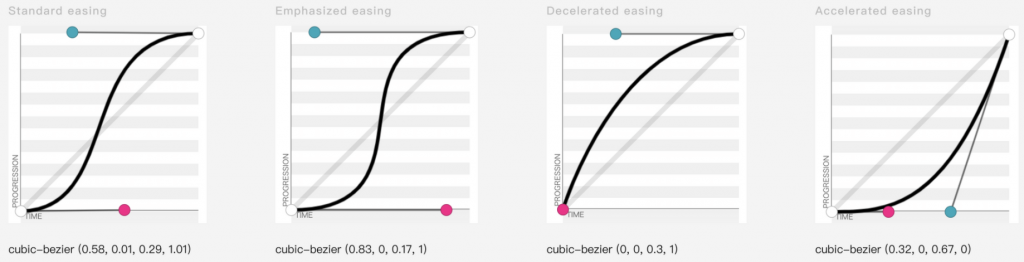
Standard Easing
- "Decelerates" by spending more time instead of accelerating, placing focus on the end of the animation.
- Elements starting and ending at rest use standard easing.
- Accelerates quickly and decelerates gradually to emphasize the end of the transition.
Emphasized Easing
- Actually very similar to Standard Easing, but emphasizes the end of the animation more than it.
- Usually paired with longer duration to convey a more stylized sense of speed.
- Accelerates quickly and decelerates "very slowly", specifically emphasizing the end of the transition.
Decelerated easing
- Applicable when components are entering from off-screen.
- Speed is fastest at the start of animation, and decelerates to a standstill at the end.
Accelerated easing
- Opposite of Decelerated easing.
- Applicable when components are leaving the screen.
- Animation starts from a standstill state, then gradually accelerates until the animation ends.
In component implementation, a Transition component is usually implemented first as the underlying interface, and then various components (like Fade, Collapse, etc.) are implemented in response to different Transition types. The remaining implementation details will be introduced to everyone in Day 11!
Summary
The introduction to Design System design ends here!
As the title says, this is the Design System that frontend engineers should know. Although we don't need to really go down and design, understanding these basic design elements will be very helpful when communicating with designers or doing Side Projects ourselves. It's like how we wish designers knew a little technology so the things designed wouldn't be so unrealistic. And as mentioned yesterday, Design System is using systematic methods to reduce uncertainty in UI, help us clarify and narrow down the scope of problems faster, confirm whether the problem is a Design System definition problem, poor UI component design itself, missed scenarios when assembling components, or wrongly mixed concepts, etc., so as not to spend a lot of extra cost when communicating with designers.
After carefully defining various basic elements in web pages through Design System, it can also greatly reduce the scenarios of adjusting for a long time due to a few pixels difference, allowing frontend engineers to achieve Pixel Perfect (making every Pixel of the web page consistent with the UI draft) faster and easier, and thus have more time to deal with business logic, performance optimization, etc.
References: